Regular Testing Graphs
Plots of perfSONAR results are generated by selecting “Throughput/Latency Graphs” on the Toolkit web interface and clicking
on a hostname, or by clicking on a box in the perfSONAR dashboard.
A sample perfSONAR data plot can be seen here.
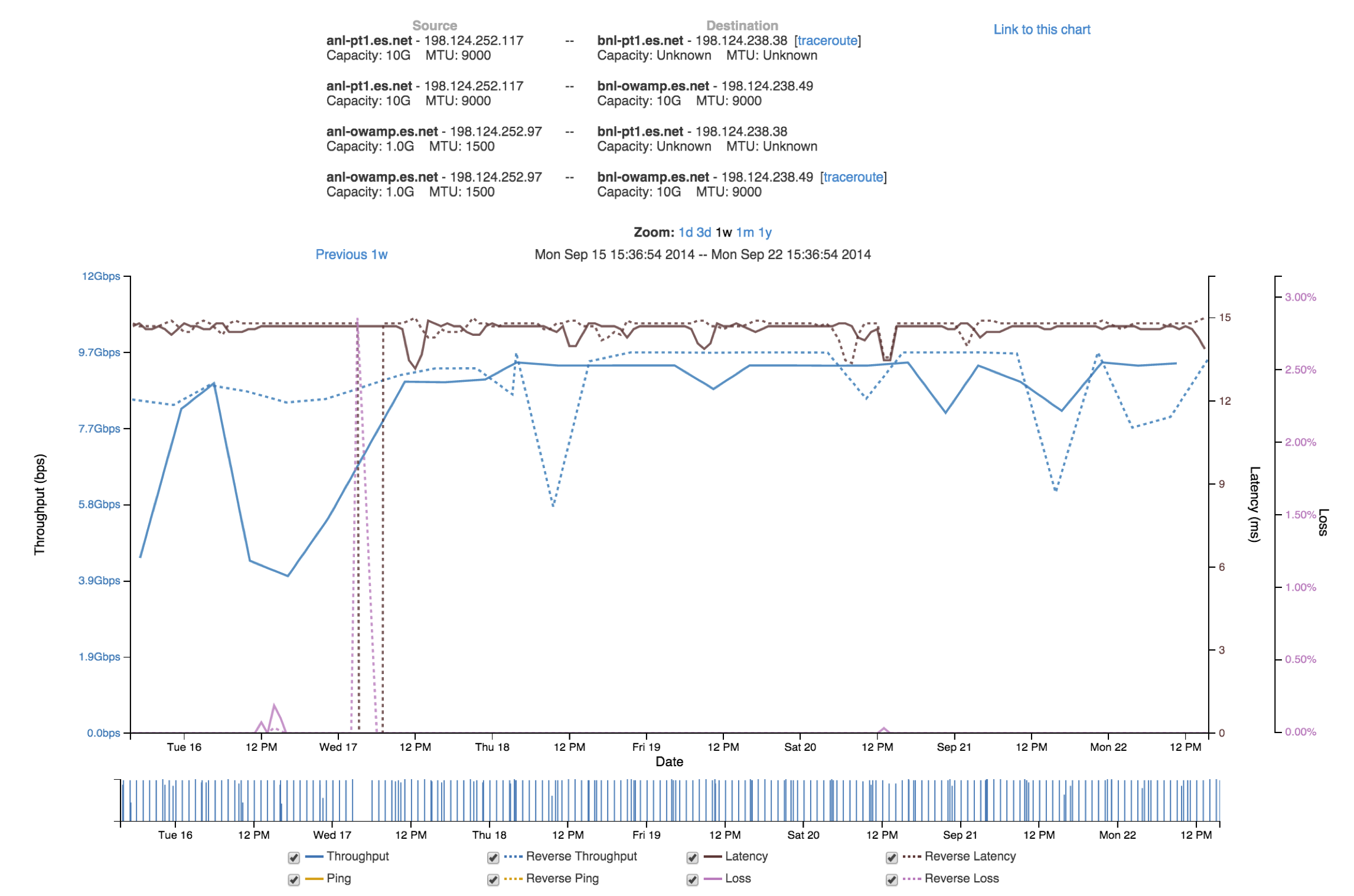
- Things to notice on this plot include the following:
- The plot show bi-directional throughput, latency, and loss data all on the same plot
- You can quickly switch between 1 day, 3 day, 1 week, 1 month, and 1 year plots.
- You can quickly bring up historical traceroute data for that path if it is being collected.
- NIC speed and MTU info is shown at the top for both endpoints.
- The ‘link to this plot’ link lets you share your view of the plot with others.
- You can hover above the label at the bottom to highlight a given plot
Some other features include:
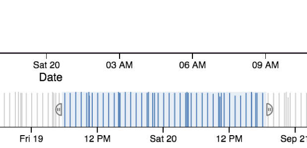
- The bar at the bottom lets you easily zoom in on areas of interest
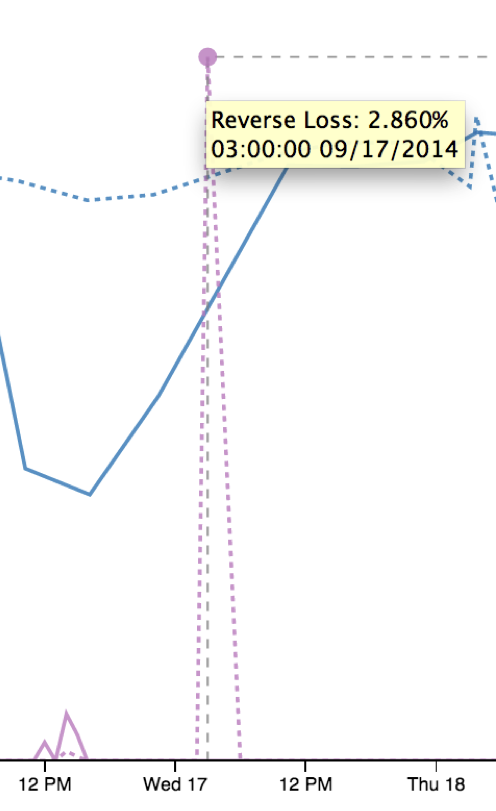
- You can hover above loss event to get more details
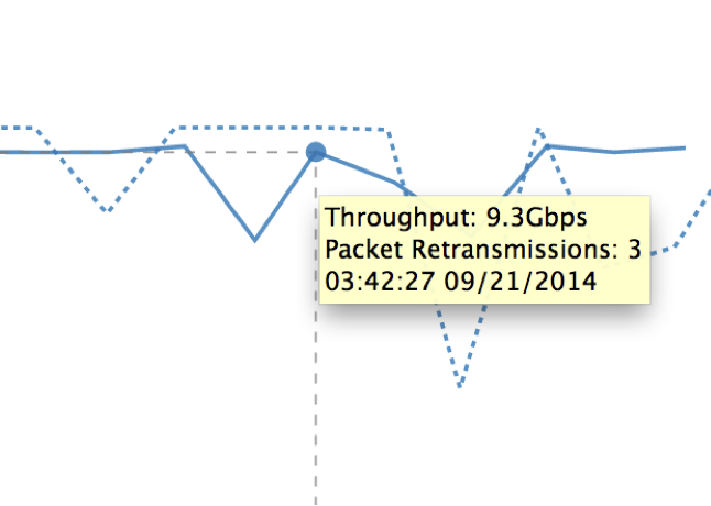
- You can hover above throughput data point also gives more details, including the number of TCP retransmits during the test