Test Results Graphs
Plots of perfSONAR test results can be viewed by selecting Details on the Toolkit web interface homepage or by clicking on a square in a perfSONAR MaDDash dashboard grid.
A sample perfSONAR data plot can be seen here:
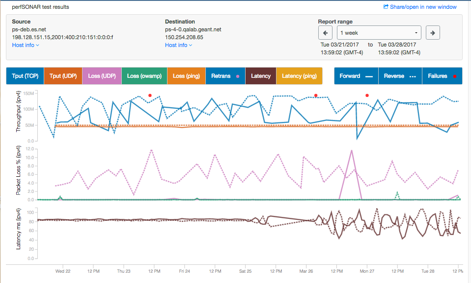
Things to notice on this plot include the following:
Bi-directional throughput, loss, and latency data are all shown on the same plot. Line colors and styles match the buttons above the graphs.
You can zoom in/out (change the time period) by scrolling with your mouse wheel or touchpad.
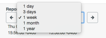
You can quickly switch between 1 day, 3 day, 1 week, 1 month, and 1 year plots using the Report Range selector.
You can move back/forth through time by clicking the left and right arrows next to the Report Range.
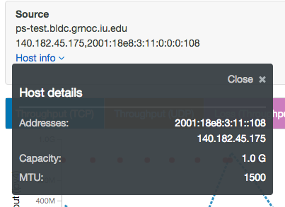
Source and Destination domain names and IP addresses are shown in the top part of the window. This also includes hosts details.
Some other features include:
Clicking on the colored boxes above the chart toggles showing and hiding that information. Note that the vertical axis scale will adjust automatically to what is shown. For example, on the chart below, test results in the reverse direction have been disabled, and only forward results are displayed. This is indicated by the background of the Reverse legend turning grey.
When moving your cursor within the plot window, an overlay will display values at the crosshair. The arrows indicate whether values are for the forward or reverse direction. The protocol (UDP/TCP) or one-way vs round-trip (owamp/ping) is given in parentheses, while the tool used for the test is given in square brackets (bwctl/ in the tool name indicates that the test is in backwards-compatibility mode with a perfSONAR 3.5 host or cannot connect to pScheduler).
You can place the crosshair over a red dot (which indicates a test failure) to see the error text.
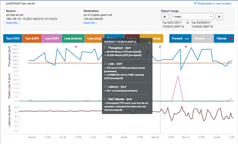
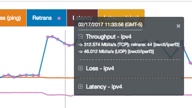
Additionally (as shown in the next image):
You can click to freeze the crosshair and then select text for copy/paste within the overlay box or use the - or + symbols to open or close different sections. Click again outside the box to unfreeze. Use the x or keep the mouse outside the plot area to make the overlay disappear.
Hover over a pink dot to see the number of retransmits.
Things to note:
- When multiple tests of the same type are run (eg, using different tools), there will be more than one curve of the same color and some may coincide. Each test will show up in the details overlay, as well. Turning off some of the lines in the plot may change the scale and allow you to see things more easily.
- The numbers in the overlay box are the “last known values.” One might expect that if there is no value for a test or quatity, such as retransmits, at the crosshair, no value would be shown, but instead, the last known value is shown. For example, at a point in the graph, there may be two distinguishable -> Throughput (TCP) values in the overlay box, but only one line. If you mouse back and forth, you’ll see that one of the values is not changing. This indicates that that particular test ended some time ago and the value being displayed is its ending value.
The Share/open in a new window link at the top right is most useful when the graph is not on a page by itself. Click to open the graph in a new window, or right click and choose Copy Link Address to get a url for the graph that can be emailed or saved.
Host details that can be displayed by clicking Host info under either endpoint:
NIC speed (Capacity) and MTU are listed, if available
A link to historical traceroute data for that path is shown, if it is being collected