Test Results Graphs
Plots of perfSONAR results are generated by selecting “Throughput/Latency Graphs” on the Toolkit web interface and clicking
on a hostname, or by clicking on a box in the perfSONAR dashboard.
A sample perfSONAR data plot can be seen here.
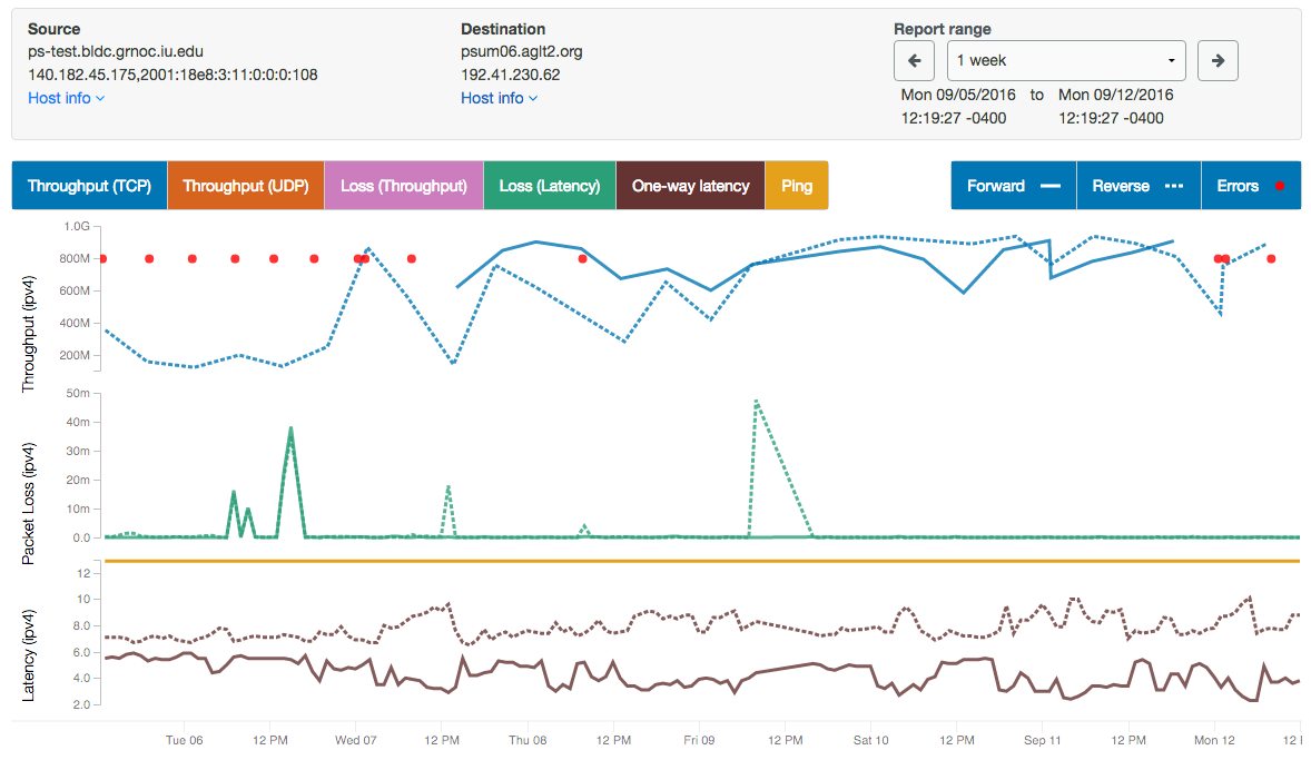
- Things to notice on this plot include the following:
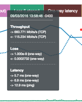
- The plot show bi-directional throughput, latency, and loss data all on the same plot.
- Scroll in/out by zooming in/out with your mouse wheel or touchpad.
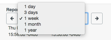
- You can quickly switch between 1 day, 3 day, 1 week, 1 month, and 1 year plots.
- You can move back/forth through time by clicking the left and right arrows.
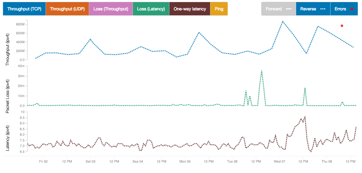
- Clicking on the colored boxes above the chart allow you to show and hide that information on the chart. For example, on this chart, test results in the forward direction have been disabled, and only reverse results are displayed. This is indicated by the background of the “Forward” legend turning grey.
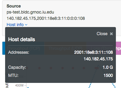
- Detailed Host Info
- More host details can be displayed by clicking “Host info” at the top for both endpoints
- NIC speed and MTU
- Historical traceroute data for that path, if it is being collected
Some other features include:
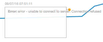
- You can hover above any events on the graph to get more details
- You can click on a red dot (which indicate test errors) to see the error text